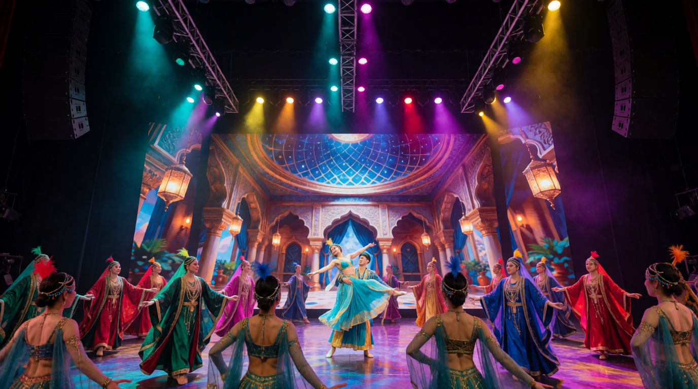
Brightness wars, creative ambition and a screen that stole the evening.
Every headliner dreams of a show the audience will remember. Few expect the audience to remember the screen behind them more than the star in front of it. This is the story of an arena concert where the LED wall became the main attraction, and of the production team that learned how fine the line is between spectacle and overshadowing.
The Arms Race of Pixels
The history of LED video is a story of escalation. After Mitsubishi’s Diamond Vision (1980) and Sony’s JumboTron (1985), the 1990s brought the first LED video walls, with large pixel pitches and modest brightness. U2’s Zoo TV tour in 1992 popularised video as a stage element, and the 2009 360° Tour used a massive cylindrical screen designed by Willie Williams, with video technology from Barco.
In the 2010s, companies like ROE Visual, Absen, Unilumin and Leyard introduced fine-pitch panels with pixel pitches under 3 mm, along with curved and flexible modules. Brightness climbed from a few hundred nits to several thousand, enabling outdoor use in daylight. The wall became not just a backdrop but a stage in its own right.
The Show and the Star
The artist was a charismatic pop singer with a loyal following and a modest stage presence. The creative director, in a bid to elevate the show, commissioned a spectacular LED set: a fifteen-metre-high wall of ROE Visual Ruby panels with a 2.5 mm pitch, plus side wings, a floor panel and a series of moving LED columns. The content was designed by a leading studio, using Cinema 4D, Notch and Unreal Engine for real-time effects.
The rig was driven by disguise servers, with Brompton Tessera SX40 processors and a grandMA3 lighting system. The budget was enormous. So were the ambitions.
The First Warning
During rehearsals, the creative team noticed something troubling. When the wall blazed at full brightness, the singer looked small. She stood in a pool of light that seemed dim against the glowing background. Her costume, a delicate silver dress, vanished into the glare. The cameras, struggling with the contrast ratio, either blew out the wall or silhouetted the singer.
The lighting designer, a thoughtful woman named Corinne, voiced her concern. “We’re building a beautiful screen and losing a star,” she said. The creative director, in love with his content, brushed her off. “People come for spectacle,” he said.
- Balance wall brightness with performer lighting to maintain focus on the star.
- Test the camera view during rehearsals, not just the human eye.
- Use brightness curves that dim the wall during intimate moments.
- Review content with the artist present, to ensure comfort.
Opening Night: The Wall Takes Over
On opening night, the arena filled with fans. The lights dropped, the wall exploded into colour and the crowd gasped. The opening sequence, a dazzling three-minute video, was a triumph of design. Pixels danced, galaxies spun and a digital phoenix rose from the floor.
Then the singer walked on. She sang beautifully. But the audience’s eyes kept drifting to the wall. A fan, interviewed afterwards, said, “I didn’t know where to look.” On social media, clips of the screen content went viral, while clips of the singer received fewer views.
The critics were polite but pointed. One review said, “The screen was the headliner; the singer was the support act.” The creative director read it twice and went quiet.
The Investigation: Why It Happened
The problem was not the wall but the balance. Several factors had combined. First, the brightness: the wall was set to 80 per cent, roughly 1,800 nits, far brighter than the lighting on the singer, which measured about 600 nits on her face. The eye is drawn to the brightest object in a scene, and the wall was the sun.
Second, motion: the content moved constantly, with rapid cuts and swirling patterns. The human visual system is wired to track movement, so the audience’s attention followed the screen. Third, scale: the wall was so large that it dwarfed the performer, making her seem insignificant.
This is not a new problem. Theatre designers have long known the principle of focus: the audience looks where the light is brightest and the movement greatest. A great designer uses these tools to guide the eye. A careless one lets them compete with the performer.
Technique: Designing for the Performer
Corinne proposed a series of changes. The first was a brightness hierarchy. The wall would be dimmed to 40 per cent during vocal passages, rising only during instrumental breaks. The singer’s lighting would be boosted, using Robe BMFL followspots and Ayrton Perseo fixtures with a warmer colour temperature.
The second was content discipline. The video team created simplified, slower-moving visuals for verses and ballads, reserving the high-energy content for choruses and drops. They used colour palettes that complemented the singer’s costume, avoiding clashes.
The third was layering. Instead of a flat wall of imagery, the designers added depth by using gauze and negative space. A black stage behind the singer made her stand out, while the wall glowed at the edges.
- Establish a content brief that defines when the screen leads and when it supports.
- Use luminance mapping to ensure the performer is brighter than the background.
- Apply colour grading to harmonise screen content with costumes and lighting.
- Include blackout moments that let the audience focus on the performer.
The Turnaround
After four shows of recalibration, the production found its balance. The wall became a partner, not a rival. During ballads, it softened into subtle gradients; during anthems, it surged with energy. The singer, no longer overshadowed, began to command the stage with newfound confidence.
Critics noticed. A later review praised the “elegant interplay of light and voice.” Social media clips now showed the singer front and centre, with the wall glowing behind her like a halo. The tour’s ticket sales climbed, and the creative director, humbled, publicly thanked Corinne for her counsel.
Business Insights: Spectacle Is a Strategy
The incident offers a lesson in brand alignment. A production’s purpose is to serve the artist’s brand. A screen that overpowers the star may impress the eye but harm the brand. Smart production companies treat design as a collaboration, with the artist, management and creative team agreeing on the balance.
It also highlights the economics of content. A bespoke LED show can cost hundreds of thousands of dollars in design and programming. If the content does not serve the performance, the investment is wasted. Companies that test content early, with the artist present, avoid expensive redesigns.
Rental houses can benefit too. Offering content consultancy and on-site calibration as add-on services creates new revenue and deeper client relationships. Companies like PRG, Solotech and Stufish have built reputations not just on equipment but on creative partnership.
The Technology Behind Restraint
Modern tools make restraint easier. Brompton Tessera processors allow precise brightness control and HDR tuning. disguise servers provide real-time brightness fade tied to timecode. Notch effects can be adjusted live, scaling intensity to the music. And grandMA3 can drive both lights and video in the same cue, ensuring that the wall and the key light move together.
Camera operators and IMAG directors play a role too. By framing the performer tightly, they keep the audience’s attention on the artist rather than the background. A close-up on a singer’s face can outshine any wall.
The Takeaway
An LED wall is an extraordinary tool, and like any tool it can overwhelm. The best productions treat the screen as a stage partner, not a rival. Balance brightness, discipline content and respect the performer. When the audience leaves humming the song instead of describing the pixels, you have done your job. And if they remember the screen, make sure it is because it made them remember the star.
